

Our Contrarian Call: A Bullish Thesis on the Energy Sector
June 16, 2017Back in December 2016, we discussed our expectation for lower longer-term US interest rates, which we used to justify an aversion to financial stocks. This expectation played out. We also discussed our rotation into the resources sector. We suggested that sometimes rotations can be bumpy, and indeed the last six months has been a bumpy rotation, with the energy sector the worst performing sector year-to-date.
We were clearly early and this has negatively impacted recent performance. We try to take a longer-term perspective and position our active strategy for multi-year leadership trends. Coming out of the 2011 lows, we held a very high proportion of our strategy in health care and consumer staples companies. Never before had we seen a bull market driven by what we refer to as growth counter-cyclical stocks. Bull markets like the 1990s or early 2000s tend to be driven by cyclical stocks. Technology drove the 1990s bull market of course, while financials drove the early 2000s bull market. We call these two sectors “hyper-cyclicals” for this very reason.
We find ourselves in a similar situation today—holding an out-of-consensus viewpoint on a certain segment of the equity market. Specifically, we continue to have a bullish disposition toward the resources sector broadly, and the energy sector in particular. We wish to review our bullish thesis on the energy sector in greater detail.
There are roughly 3,200 companies in the top 85% of the market cap of all 46 developed and emerging market economies. We have created a set of market-cap weighted indexes around this global selection universe that we call the Knowledge Leaders Selection Universe (KLSU) Indexes. These indexes, which are similar to the MSCI Global Indexes, are our starting point for selecting equities for our active portfolios. We’ll be referring to these indexes for the duration of this letter. In particular, we’ll be referring to our developed market KLSU energy indexes, including:
- KLSU DM Americas Energy Index, which includes the top 85% of all energy companies in the US and Canada. This index contains 60 companies and has a market cap of $1.64 trillion.
- KLSU DM EMEA Energy Index, which includes the top 85% of all energy companies in Europe. There are 26 companies with a market cap of $736 billion.
- KLSU DM Asia Energy Index which includes the top 85% of all energy companies in Asia. There are 14 companies with a market cap of $95 billion.
The ideal attributes we look for in a stock are:
- It is within a group that has been down for at least 7-9 years. This generally indicates a group where valuations have compressed, sentiment is low and stocks can be accumulated at attractive prices.
- Companies have slashed capital expenditures. Generally, when capital expenditures industry-wide decline, the result is improved pricing. This is particularly relevant for an extraction industry like energy. We will get into more details on this shortly.
- Companies have a cheap multiple to assets and/or sales. When companies experience secular downturns, flow-based measures like earnings or cash flow can be difficult valuation inputs. We prefer asset-based measures.
- Companies are out of fashion among investors. Technicals can be helpful here to quantify the extent to which investors are shunning a certain group. Very often, and we’ll argue now is one of those times, investors engage in capitulation, which can give investors a great chance to buy that cheap company at even cheaper prices.
- An opportunity for diversification. Stocks in sectors that have experienced a low correlation to the benchmark have tremendous diversification potential.
Underperformance
Eight years into an economic recovery, with the S&P 500 having gone from 666 to 2,430, these are very difficult criteria to find in potential investments. Broadly, there is only one sector in the world that fits our criteria, and that is the resources sector. For now, I’ll focus on the energy sector, but most of my comments are applicable to the basic materials sector, particularly metals, both industrial and precious.
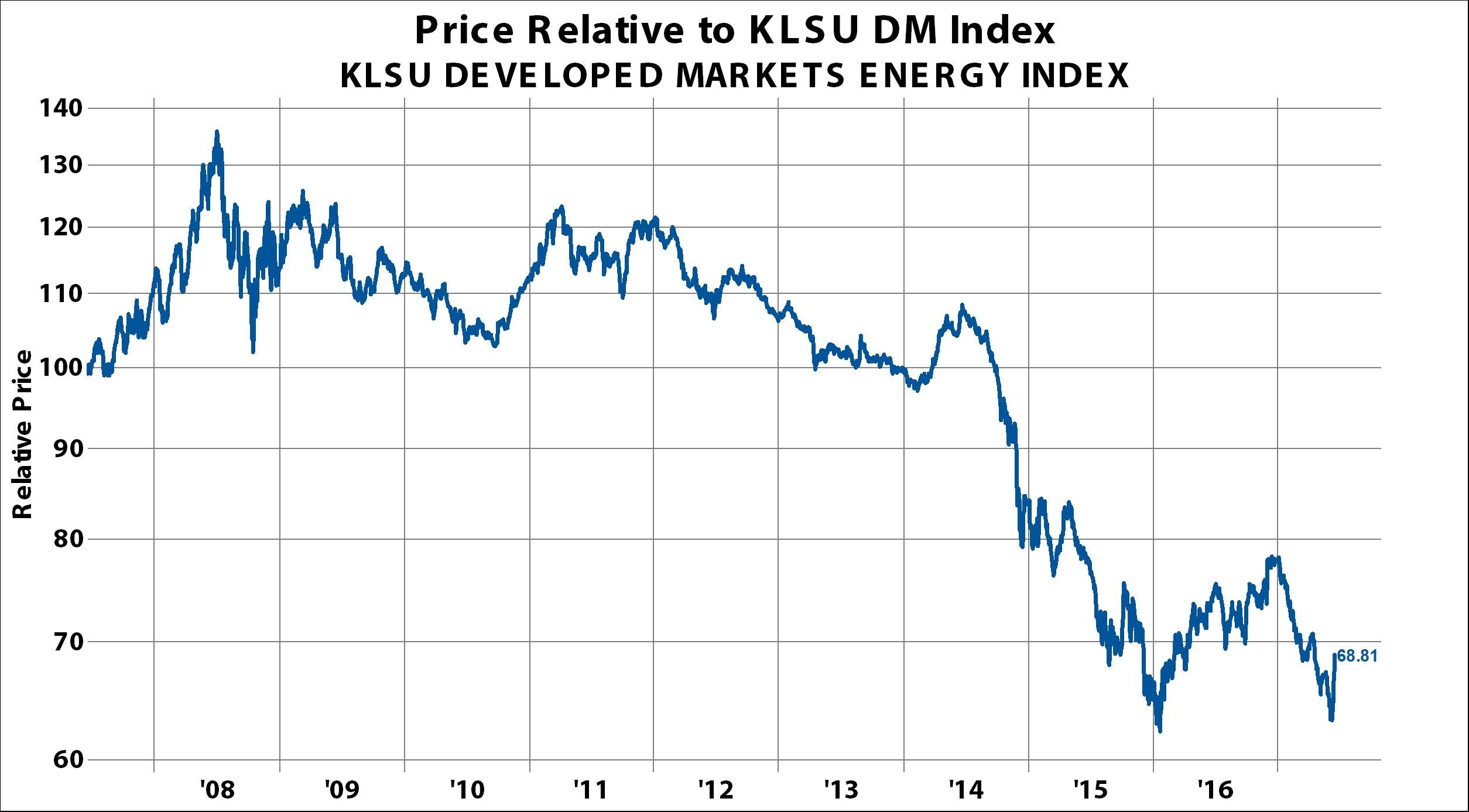
With an index base value=100, starting 10 years ago, our KLSU DM America’s Energy Index is down a cumulative 20.25%. From its high of 128.5 on May 20, 2008, the index is down 38% from peak to present. Lows in this index were made in March 2009, with the rest of the market, at 55.5, down 57% from the May 2008 peak. In January 2016, the index hit 64, not taking out the lows from 2009. The current index value of 79.75 is up 25% from the lows last January, but as mentioned earlier, is still net down 38% from 2008 highs.
European energy stocks have fared even worse. With a similar 10 year look back, and index value=100 at the start, European energy stocks are down 41.27%. They peaked in May 2008 at 124, and then fell to an ultimate low of 50.75 in March 2009. That was a 48% drop over 10 months. In contrast to North American energy stocks, the European energy sector did take out 2009 lows in January 2016. On January 20, 2016, the index bottomed at 47.5. The peak-to-trough decline for European energy stocks was 62%. European energy shares have rebounded back to a current index level of 58.75, or some 24% higher.
Asian energy stocks, using the same index methodology as the previous two examples, are down 44.8% over the last 10 years. After peaking at 133.3 in May 2008, Asian energy shares fell to a low in October 2008 at 52.15. The decline was 61% peak-to-trough. Similar to European energy stocks, Asian energy shares did take out the 2008 lows in January 2106. Asian energy stocks ultimately fell to an index level of 42.1 and have since rebounded to an index level of 55.2. From the highs in 2008, Asian energy stocks are down a cumulative 59%.
In relative performance terms, the underperformance of the global energy sector has been even more extreme. From peak values in May 2008, regional energy sectors are down:
- North America down 52% relative to MSCI World Index.
- Europe down 53% relative to the MSCI World Index.
- Asia down 67% relative to the MSCI World Index.
Capital Spending
Next, let’s look at the change in capital spending. Global energy sector capital spending peaked around $500 billion in 2014. Since then, spending has fallen almost $200 billion.
This 35% cut to capex is much larger than anything experienced in the 2008 recession, where capex cuts were less than $100 billion. Capital spending actually increased during the 2001 recession. Capex levels globally are back at 2008 levels, around $325 billion.
In particular, the North American energy sector cut its capex by over $100 billion since the early 2015 peak. North America represents roughly two-thirds of total global energy capital expenditure and over half of the $200 billion cut to capex.
Of the $200 billion drop in energy capex, Europe accounted for about a quarter, or about $60 billion. Capex peaked for European energy companies in 2014 at about $170 billion. Here again, these cuts are 3x larger than what we experienced in the 2008 recession. European energy companies also increased capex during the 2001 recession.
Developed Asia is by far the smallest portion of the energy market, but still capex came down roughly 40%, or $8 billion. It peaked around $20 billion in 2014 and is currently a little more than $12 billion. Asian energy producers did not cut back on capex in the 2008 recession or the 2000 recession.
For energy producers, inventory levels are highly related to capital spending and demand. The commercial inventories in the US represent the lowest-cost storage in the world. The five largest US crude oil storage facilities (and capacity) in the US are: 1) Cushing (82 million barrels), 2) Louisiana Offshore Port (62 million barrels), 3) Houston (36 million barrels), 4) Beaumont-Nederland (30 million barrels), and 5) St. James Louisiana (30 million barrels). These five storage facilities represent roughly half of all US commercial storage. Storing oil on contracted VLCCs (very large crude carriers) would be the most expensive way to store oil.
With respect to inventories, there are some interesting relationships I would highlight. Commercial inventory levels hovered around 350 million barrels from 2011 to 2014. Then in the spring of 2015, they leapt to 450 million barrels before backing down to 425 million in the fall. But, before year-end, 2015 inventories were building again and pushed to 500 million barrels in early 2016. Inventories then fell back to around 475 million barrels by the fall of 2016, but then they surged again to a peak of 530 million barrels by March of 2017. Since then inventories have backed down about 20 million barrels to about 513 million.
In general, what we saw over this period of inventory building was that when inventories built, the broad US stock market outperformed the MSCI World Index, and when inventories fell, they underperformed. The surge in the NASDAQ in the last few years is the best illustration of this. The global energy sector behaved in the exact opposite manner. When inventories built, global energy stocks underperformed the MSCI World Index, and when they fell the energy sector outperformed. Focusing on US commercial inventories is a great barometer of the global inventory situation since US commercial storage is the cheapest in the world. If there are draws on US inventories, then there are clearly bigger draws on higher cost storage.
The International Energy Agency came out on June 6, 2017 affirming demand projections for 2017 and 2018. Specifically, they see demand increasing by 1.54 million barrels/day in 2017 and 1.62 million barrels/day in 2018. These estimates represent growth rates of roughly 1.7-1.8% for this year and next. This would represent among the higher growth rates that the world has experienced over the last decades.
Valuations
In cyclical industries like resources, valuations can be tricky. Flows fluctuate wildly. In depressed cyclical industries, we prefer to focus on asset-based valuation metrics like price-to-book value. US energy stocks sell at a premium to the rest of the world, but in all regions, valuations hover near 15 year lows. Over the last 20 years, the highest multiple achieved for North American energy producers was 3.5x our intangible-adjusted book value, where we credit companies with their innovative investments. The low was 1.3x in January of 2016 and is now at 1.7x. Values only dipped below 1.5x book value for one quarter in 2009 and two quarters in 2016.
Using our intangible-adjusted price-to-book value metrics, European energy stocks are selling at a 5% discount to book value. Multiples peaked at 2.7x in 2005 and have been sliding since. Trough valuations in January 2016 were .7x book value.
Asian energy shares are the cheapest in the developed world, currently selling for .8x intangible-adjusted book value. Multiples peaked in 2006 at 2.7x book value and troughed in January 2016 at .65x book value.
As a cross check, we’ll also look at the median stock (the visual middle) in the group. The message is the same, with median valuations hovering near 15 year lows. Median valuations in all regions are in the bottom quartile of the last 15 years.
Technicals
There are lots of ways to illustrate how out of favor energy stocks are right now. I’ll focus just on the North American energy sector because the statistics are most acute. Only 11% of US energy stocks are above the 200-day moving average. 30% marks oversold in our work. These oversold levels are matched by similar readings in 2009 and 2016.
Over the last 65 days, as energy has slumped, 38% of stocks are making new 65-day lows. Readings in 2008 spiked to almost 100%, and in 2016 they hit 80%, but remember we are 9 years into the liquidation and should expect more modest readings. Nevertheless, 40% marks an oversold reading in our work, so we are about there.
Only 8% of North American energy stocks outperformed the developed world over the last 65 days. This is close to the worst reading we have ever seen. In March, we hit a low of only 2%, which was the most extreme stat we have ever seen for North American energy shares. At the depths of the 2008 sell-off, we only hit a reading of 5%. Capitulation is clear here.
The performance of stocks is a function of: 1) the percent of days that the stock is up, 2) the amount it is up/down each day. Focusing on the first variable, the percent of days that stocks are up or down is highly mean reverting to 50/50. This mean-reverting randomness (like flipping a coin) is the essence of work like Burton Malkiel’s, “A Random Walk Down Wall Street.” In the real world, stocks go on runs and slumps, periods where the percent of days up are more than 50% or less than 50%. A group experiencing a string of sub-50% readings suggests it’s in a slump. In other words, it represents a group in liquidation. For the better part of the last decade, the percent of up days for the energy sector averaged around 45%. This is illustrative of how long energy stocks have been in a slump. Currently only 40% of the last 88 trading days have been positive days for the North American energy stocks. The lowest readings were registered in 2008 and 2016, when only 35% of trailing 88 trading days were positive.
Diversification
There are three basic ways to manage the risk of an equity portfolio:
- Diversify, by owning a collection of stocks from different industries
- Hedge, by shorting stocks or equity futures
- Buy insurance, like buying an out-of-the-money put option.
The essence of diversification is choosing assets that are not perfectly correlated with each other. The logic is simple enough: when one asset zigs, another zags. Years ago, finance scholars proved that a portfolio of securities is less risky than an individual holding, and the idea of diversification as a risk management tool was born.
When I survey the landscape of US equities, it appears that there are very few opportunities for diversification. My method is simple: I look at the correlation over the last 10 years of each North American sector in our global Knowledge Leaders Selection Universe (KLSU) Indexes to the S&P 500 Index.
Starting with the consumer sectors, it is amazing to see a 98% correlation. Now the consumer discretionary sector outperformed the broader North American equity market, but I am not so concerned with relative performance in this exercise. Rather, I am interested in identifying sectors that can add diversification to a portfolio. Clearly there is little portfolio diversification owning discretionary shares.
Same story when I look at the consumer staples sector. It has a 97% correlation with the S&P 500 over the last decade. Next is the financial sector, where again we see very high correlations. The North American financial sector has a 92% correlation with the S&P 500. On to health care next. Again, I see little diversification benefit to a sector that is 97% correlated with the S&P 500. The industrial sector takes the cake for the sector with the highest correlation to the S&P 500. It has an amazing 99% correlation over the last decade. No diversification here. Closely behind the industrial sector is the technology sector, with a trailing 10 year correlation of 98%. Even the staid telecom sector has an 85% correlation with the S&P 500 over the last decade.
To highlight the concentration of returns and difficulty finding good diversification opportunities:
- 8 out of 10 sectors in North America have a correlation to the S&P 500 over 80%.
- 7 out of 10 sectors in North America have a correlation to the S&P 500 over 90%.
- 5 out of 10 sectors in North America have a correlation to the S&P 500 over 97%.
For those still pursuing active asset allocation, there are two sectors in North America that should come into focus. The energy sector has the lowest correlation to the S&P 500 of any sector. Over the last decade, the sector only has a 32% correlation with the S&P 500. This means the S&P only explained about 9% of the movements of energy stocks (the r-squared). With correlations this low, energy shares appear to be an effective diversifier.
The sector with the next lowest correlation is the basic materials sector. Here the correlation over the last decade is somewhat higher than energy at 50%, which means the S&P 500 explained about 25% of the returns in the materials sector (r-squared). But still, the sector is really driven by idiosyncratic features like the price of copper or polyethylene.
The take-away for all those for that practice diversification as a risk management tool is that the resources sectors are really the only sources of diversification in the US equity market right now. While a portfolio with a good allocation to resources is likely underperforming the benchmark this year, if/when the US equity market experiences another bout of “risk off,” like it did last Friday, these areas should bolster portfolio performance.
Conclusion
When I put this all together, I see a group:
- That has massively underperformed over the last decade,
- That has slashed capex to decade lows,
- That is in the lowest quartile based on price-to-intangible-adjusted book value,
- Appears to be experiencing capitulation, punctuating how out of fashion the group is,
- That has a low correlation and thus offers effective diversification.
As I said earlier, the resource sector broadly (energy and materials) are the only groups that meet all the criteria we like to identify. Why this combination of variables? It is generally a set up for a multi-year period of outperformance.
Suffice it say the rest of the equity markets appear as the polar opposite of this set-up. Most other segments of the market have outperformed, capex is near all-time highs, valuations are extended and sentiment is euphoric. I think all the references to FANG (Facebook, Amazon, Netflix and Google) crystallize this. Similar to the early 1970s, where companies that were secular growth stories perceived to deliver consistent earnings (Avon, Polaroid, etc.), the Nifty-Fifty as they were called, promptly fell 50-80% in the 1973-1974 bear market.
From May 2015 to February 2016, the oil stocks were liquidated much worse than the oil price itself. This type of behavior marked the low in energy stocks in December 1987, February 1992 and March 2009. Assets in Rydex energy funds are down to only $26 million, unchanged from the February 2016 low, having fallen from $114 million at the peak in July 2014. Some energy stocks have recently taken out February 2016 lows, but I don’t think they go deeper. We expect a slow multi-year rebound in energy stocks.
We’ve definitely been early on our energy call, but I think the stars are aligning for the energy sector to outperform in the near future.
Source: Factset. As of 5/31/17.
This report was sent on 6/14/17. An investor cannot invest directly in an index. Any reference to Index performance does not represent the performance of any investment product offered by Knowledge Leaders Capital, LLC. The performance of client account may vary from the Index performance. Index returns shown are not reflective of actual investor performance nor do they reflect fees and expenses applicable to investing. The Index data is the property of Knowledge Leaders Capital.
The KLSU DM Americas Energy Index, KLSU DM EMEA Energy Index and the KLSU DM Asia Energy are subsets of the GKCI Developed World Index (ISIN: US36808D1090, CUSIP: 36808D109) and the launch date for the overall index is 4/1/16 and the base date of the index calculation is 3/31/2000. The returns of the Index prior to the launch date are based on applying the rules in effect as of the launch date retroactively to historical periods to and including the base date. Such historical results are not based on an Index that was maintained in real time. Index returns shown are not reflective of actual investor performance nor do they reflect fees and expenses applicable to investing.
An investor cannot invest directly in an index.
The information contained herein is provided for informational purposes only and should not be considered investment advice or a recommendation of any particular security, strategy, or investment product. The material contains the opinions of the manager and such opinions are subject to change without notice. The strategies discussed in the presentation may not be suitable for all investors. KL Capital makes no representations that the contents are appropriate for use in all locations, or that the transactions, securities, products, instruments, or services discussed are available or appropriate.
PAST PERFORMANCE IS NOT NECESSARILY INDICATIVE OF FUTURE RESULTS.
